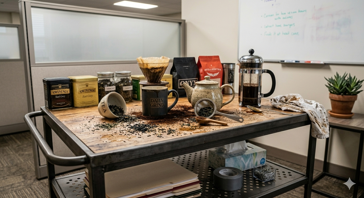
Discovery Through Making
Starting with function, an iterative process of play through rapid prototyping revealed what could be removed, refined, and unified, bringing the system toward a more resolved final form.
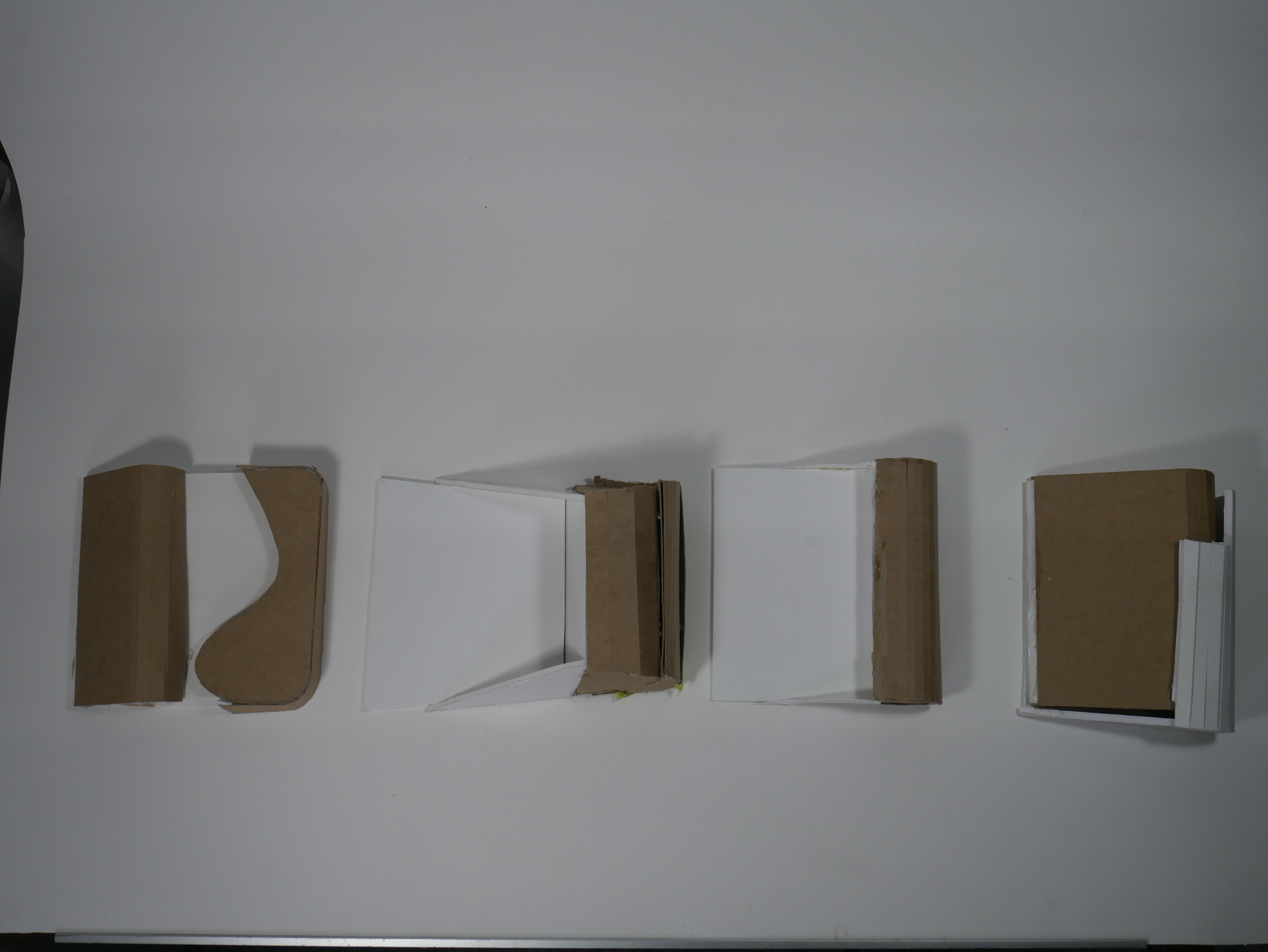
First instinct — rough, blocky, no form cohesion. Useful only as a starting point to understand the scale and basic motion of the task.
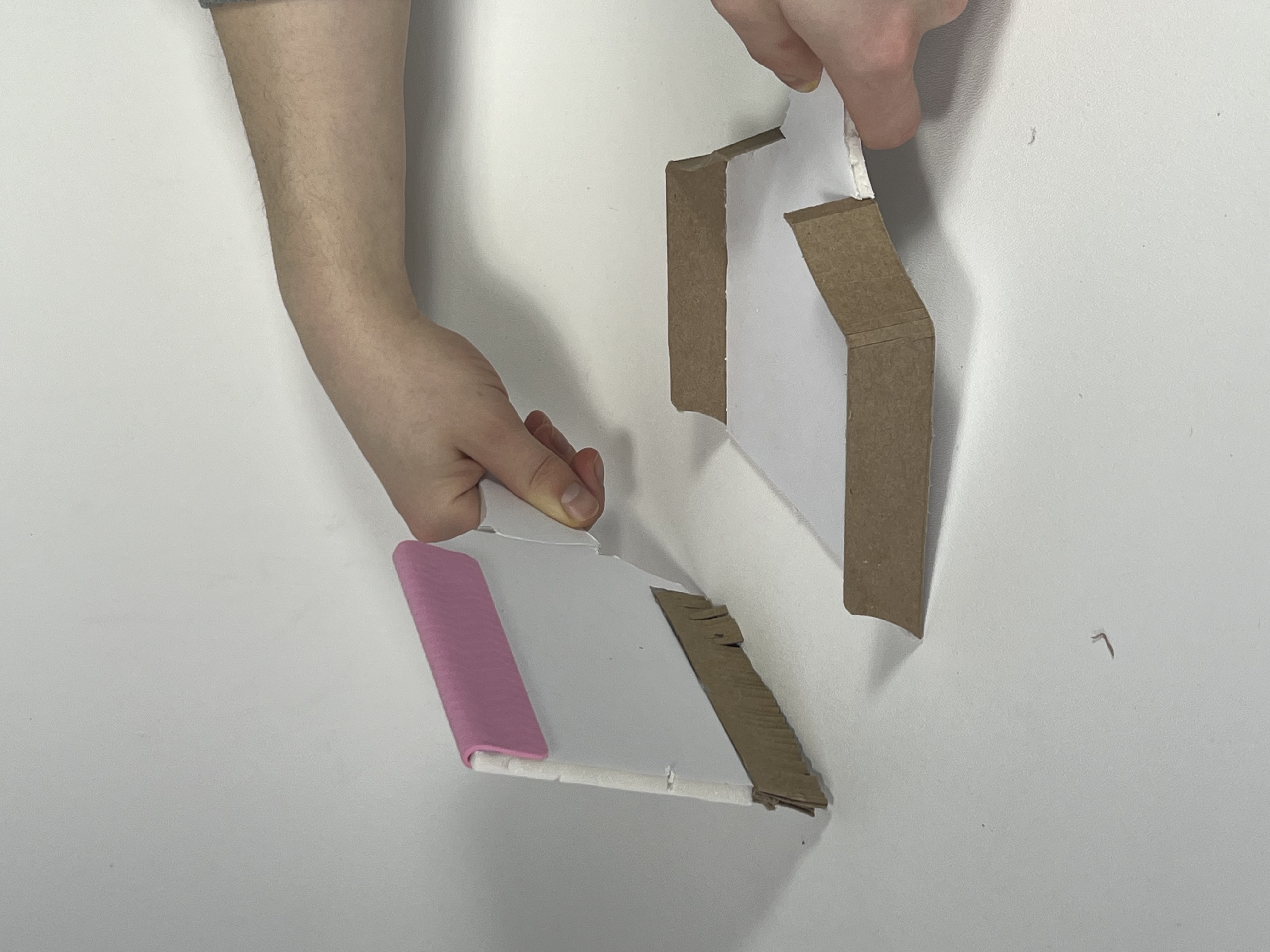
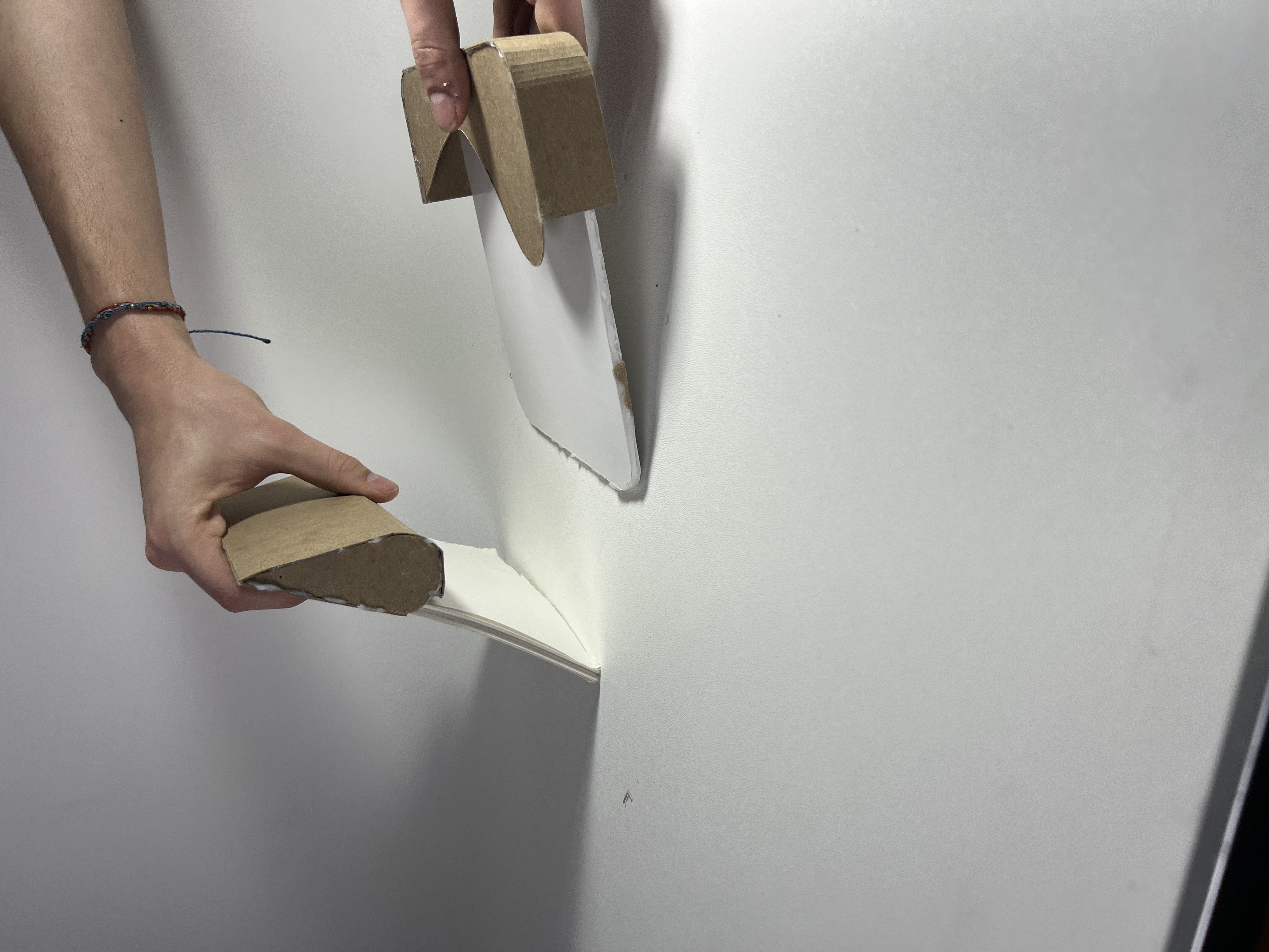
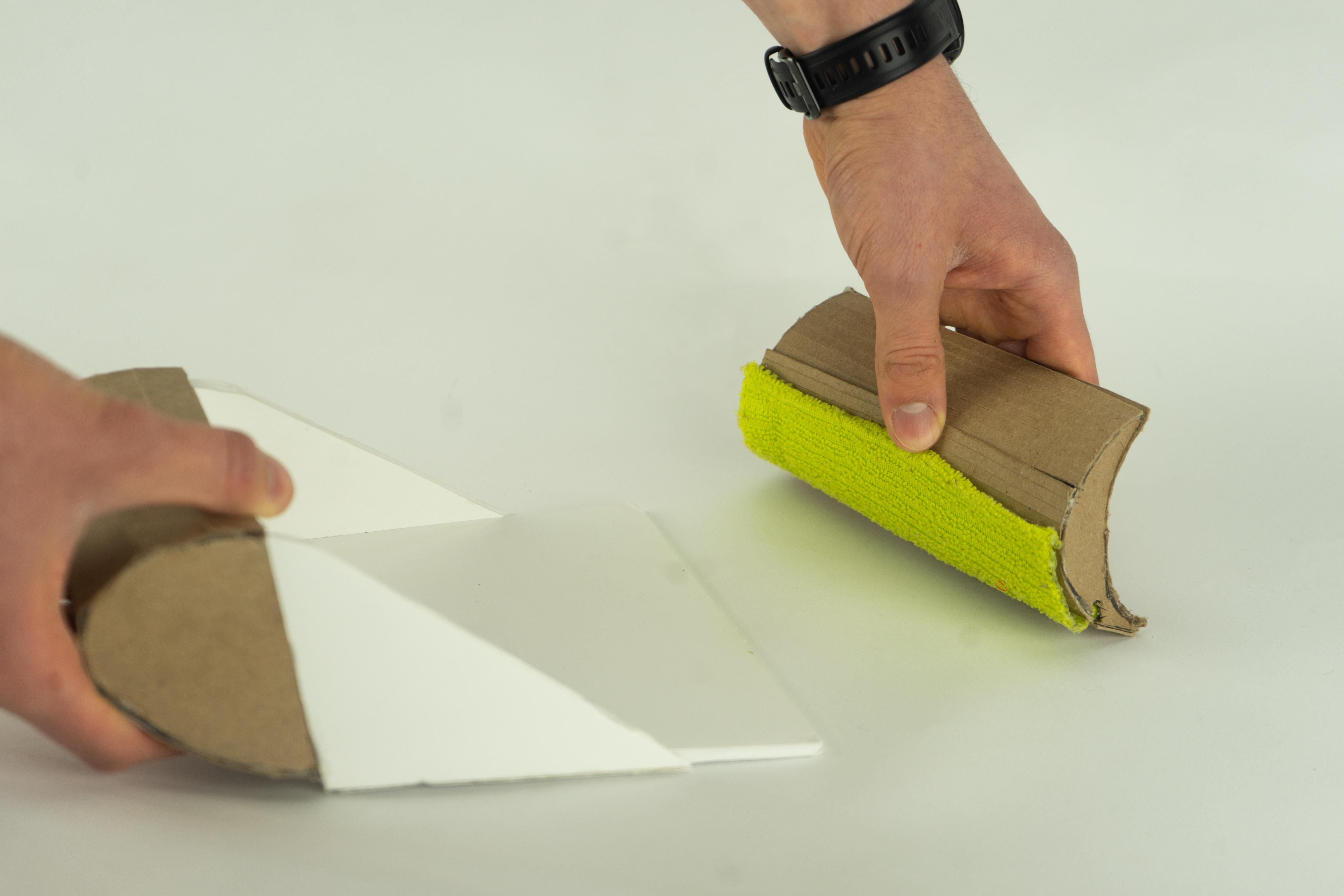
Introduced a curved sweeping edge. The collector still felt like a separate object — no visual or physical relationship between the two parts.
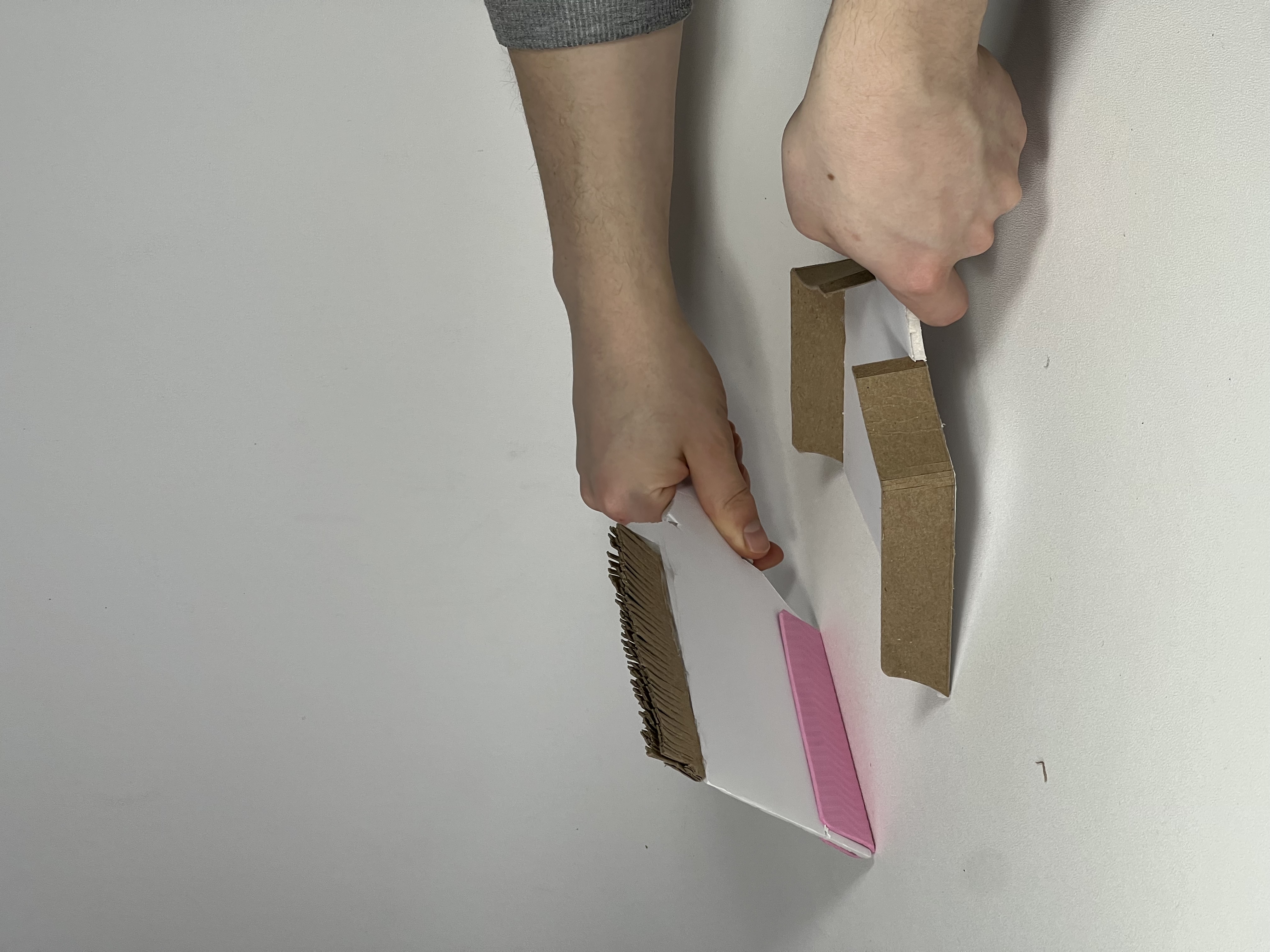
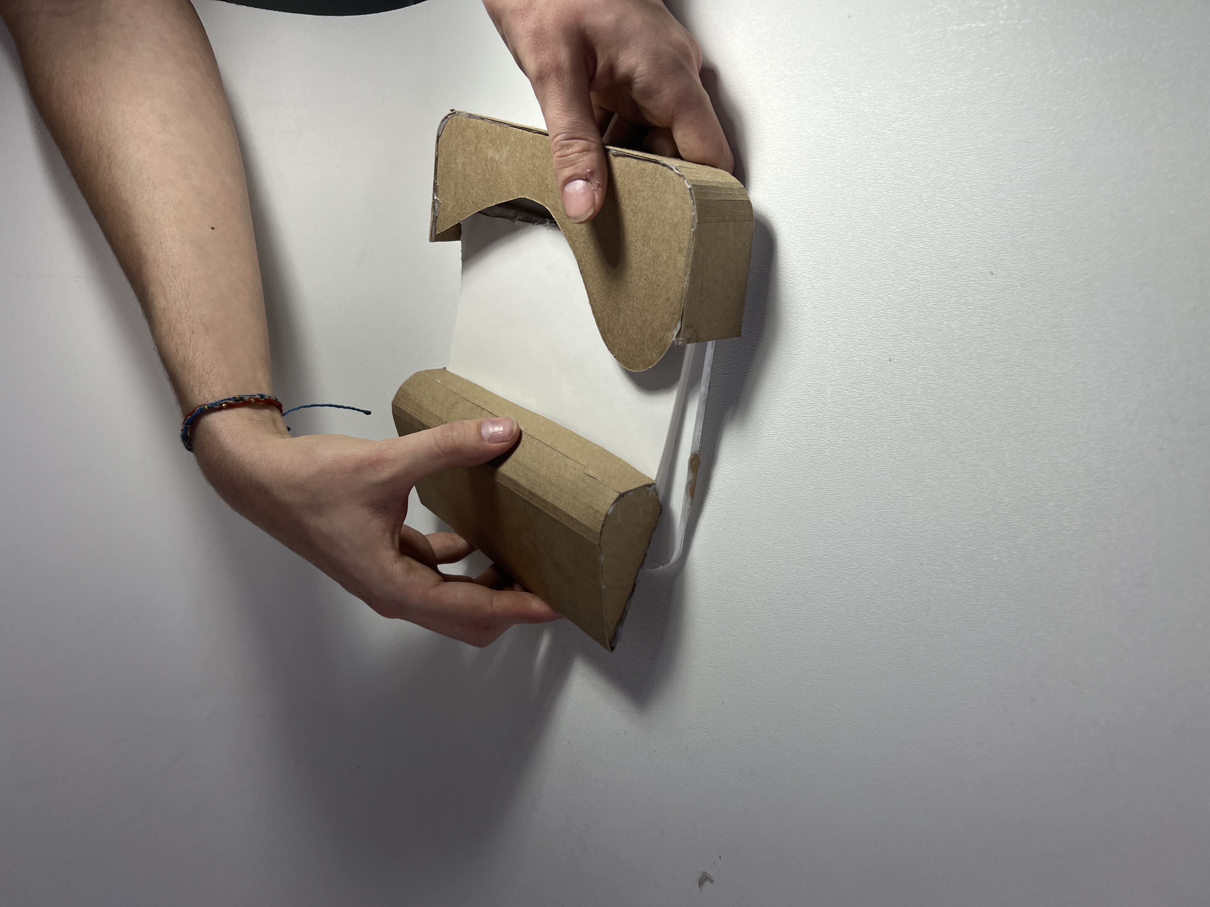
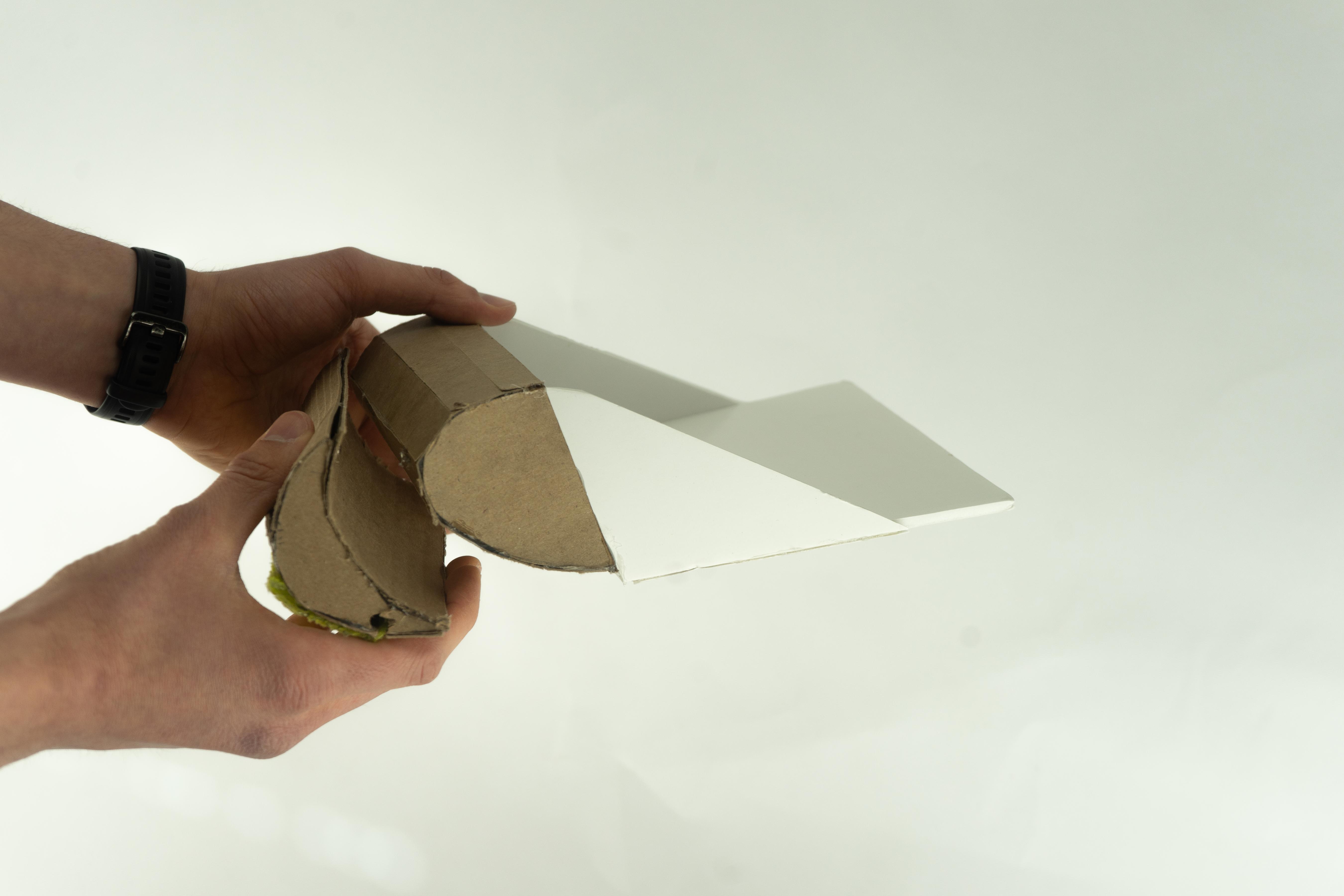
Explored nesting for the first time. The wave curve began to emerge as both the ergonomic and structural logic of the system.
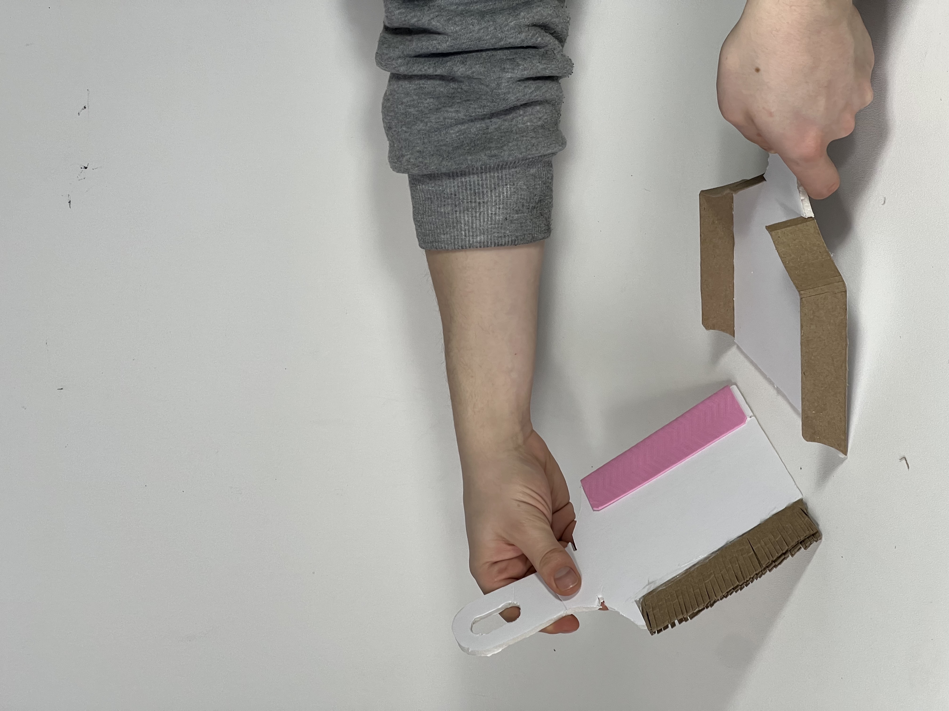
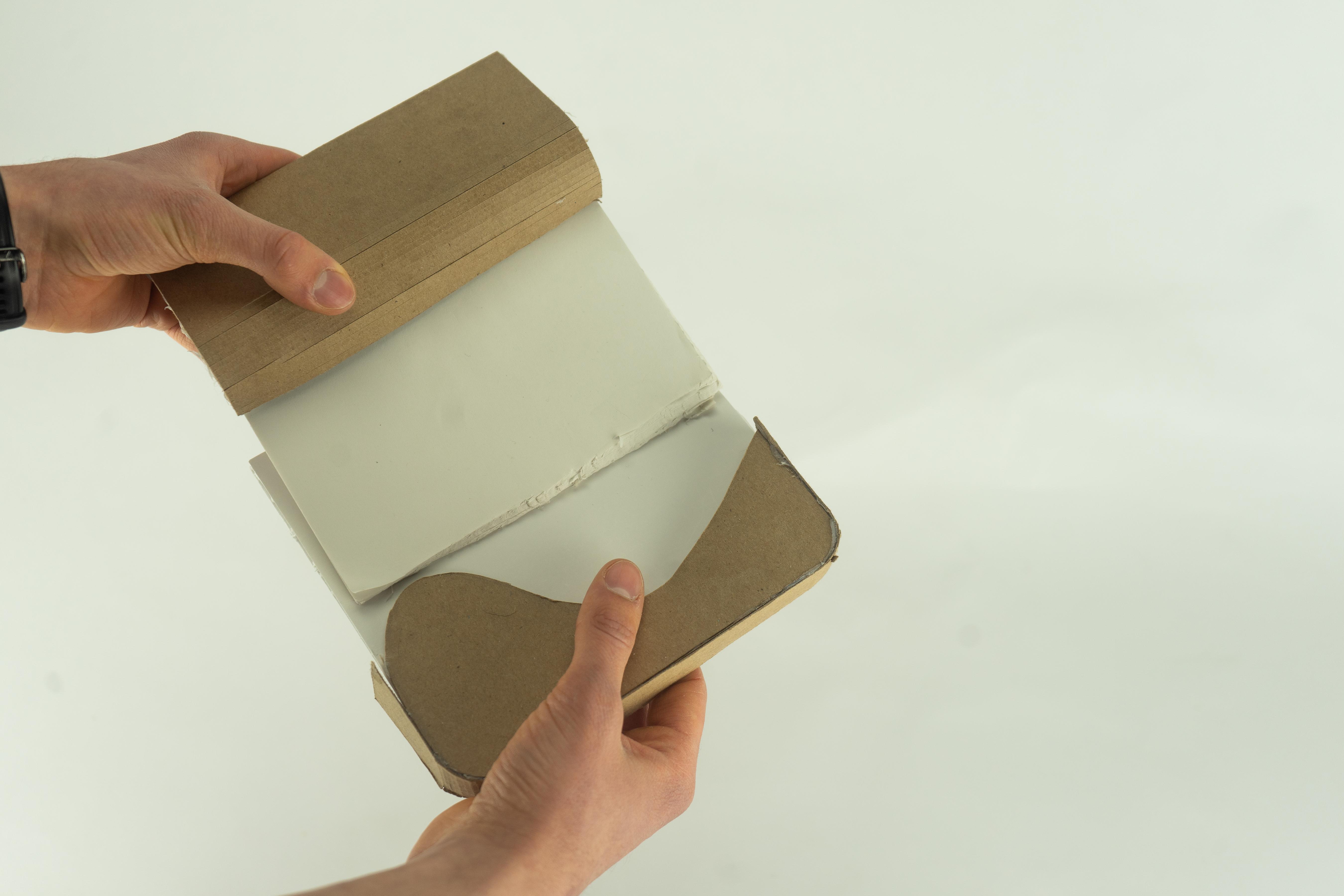
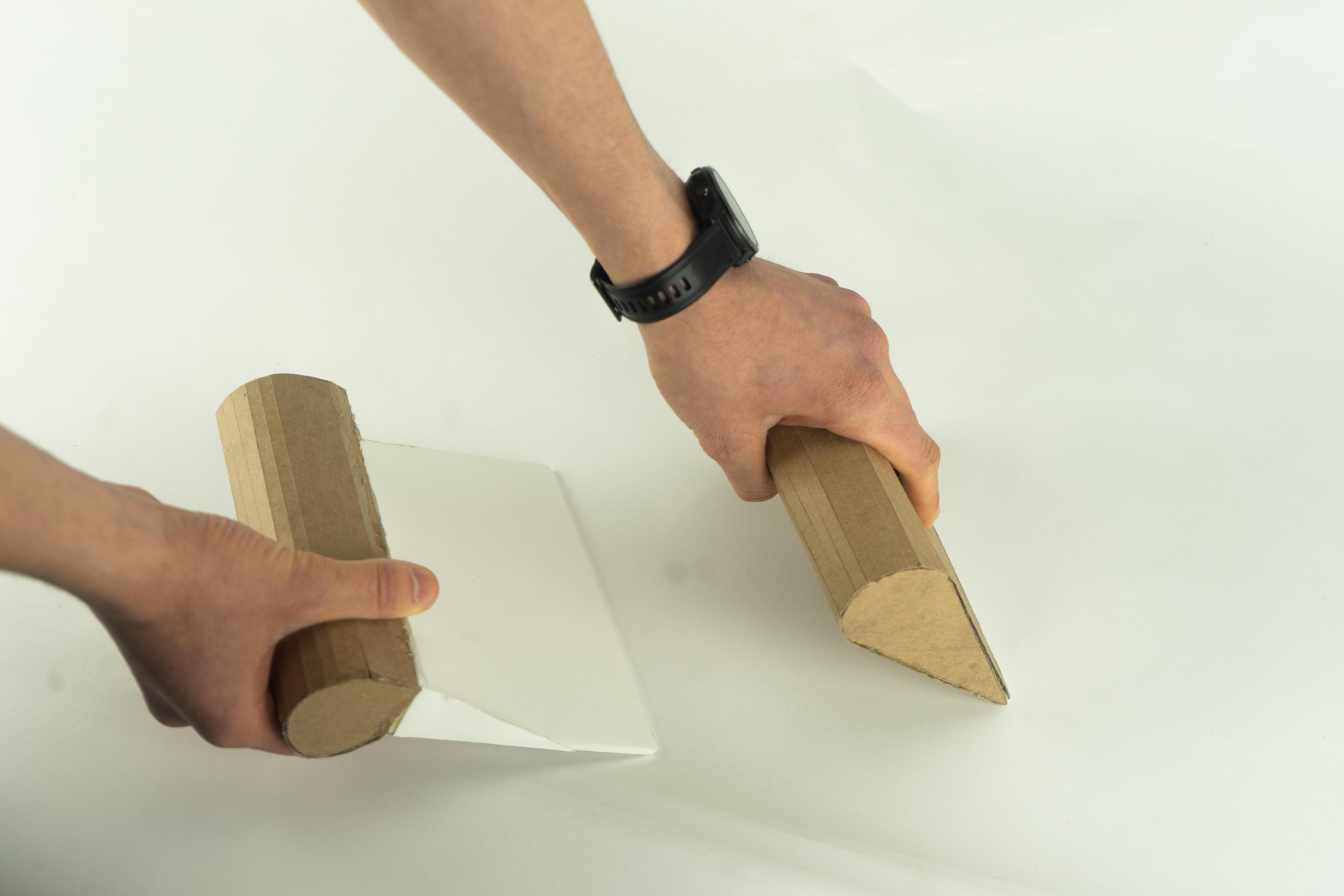
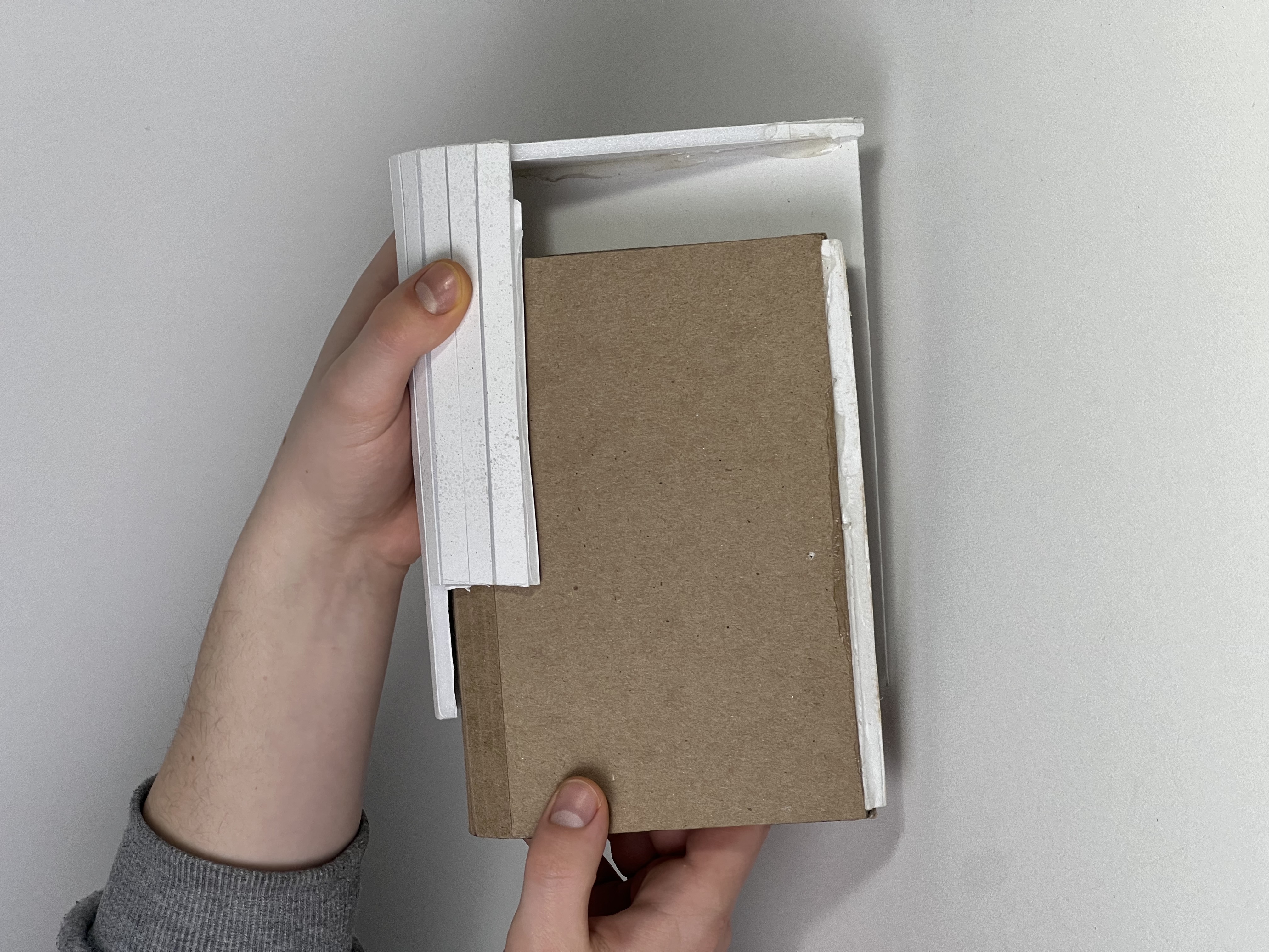
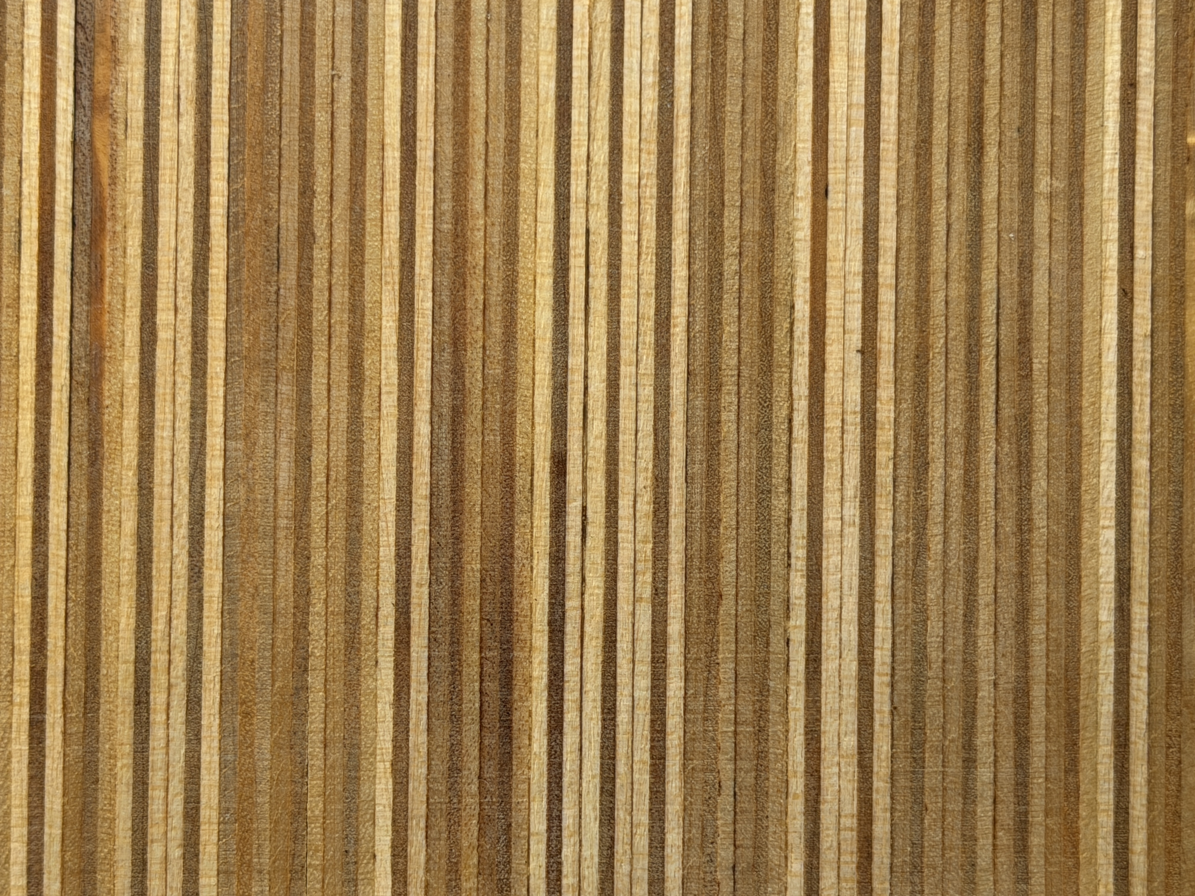
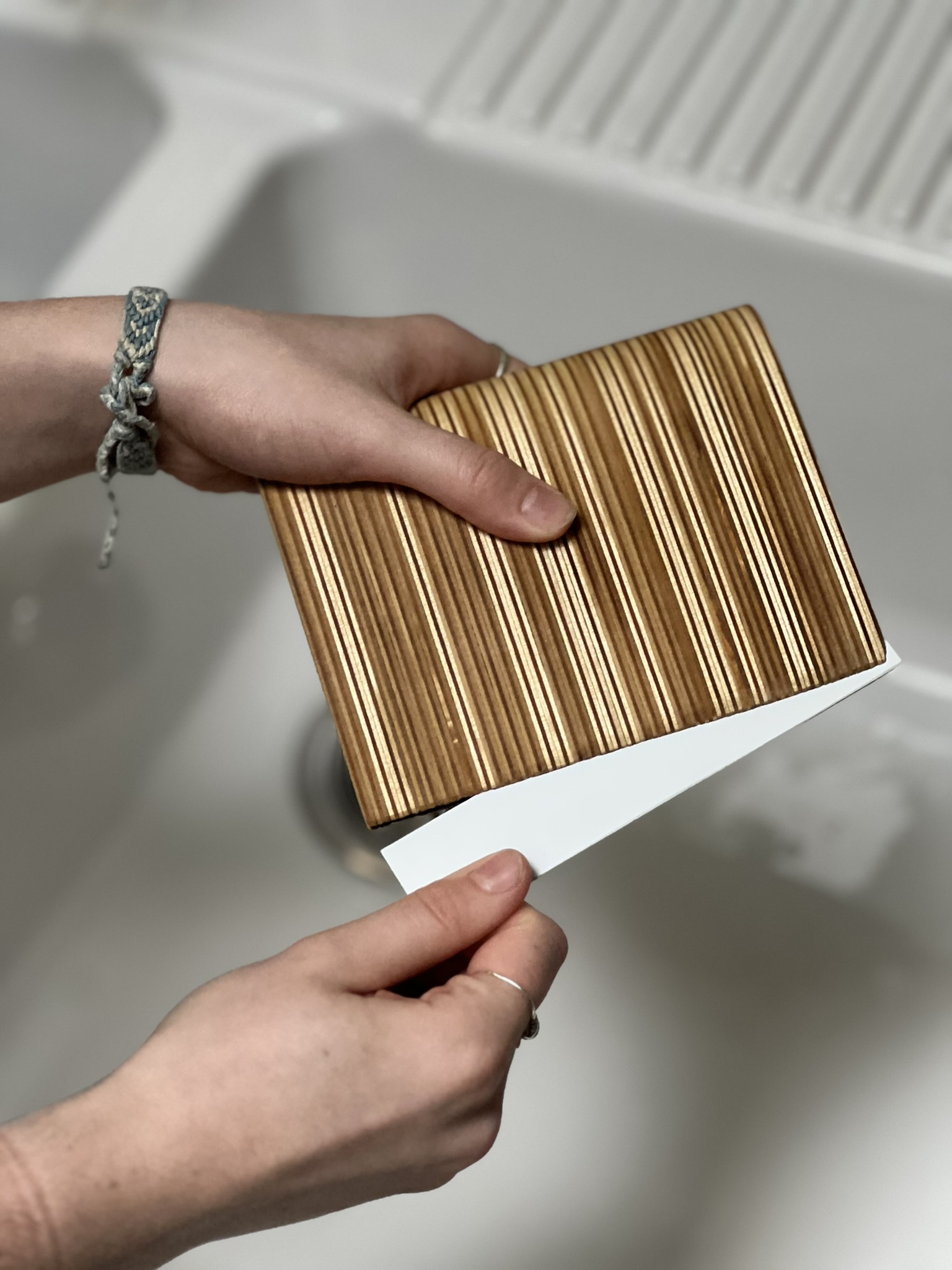
Refined the swoop and tightened the nesting fit. Material contrast between wood handle and PS collector was tested here for the first time.
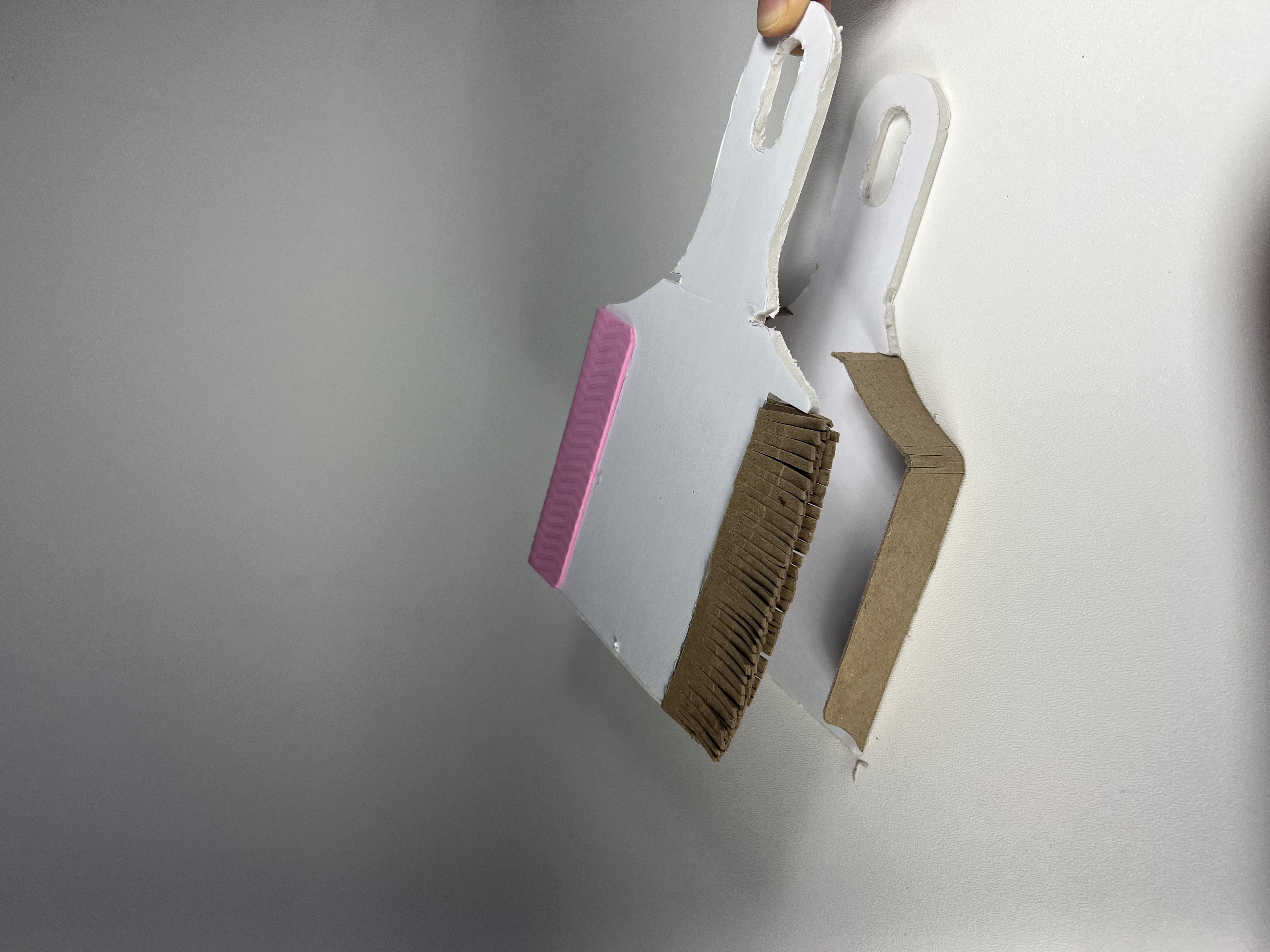
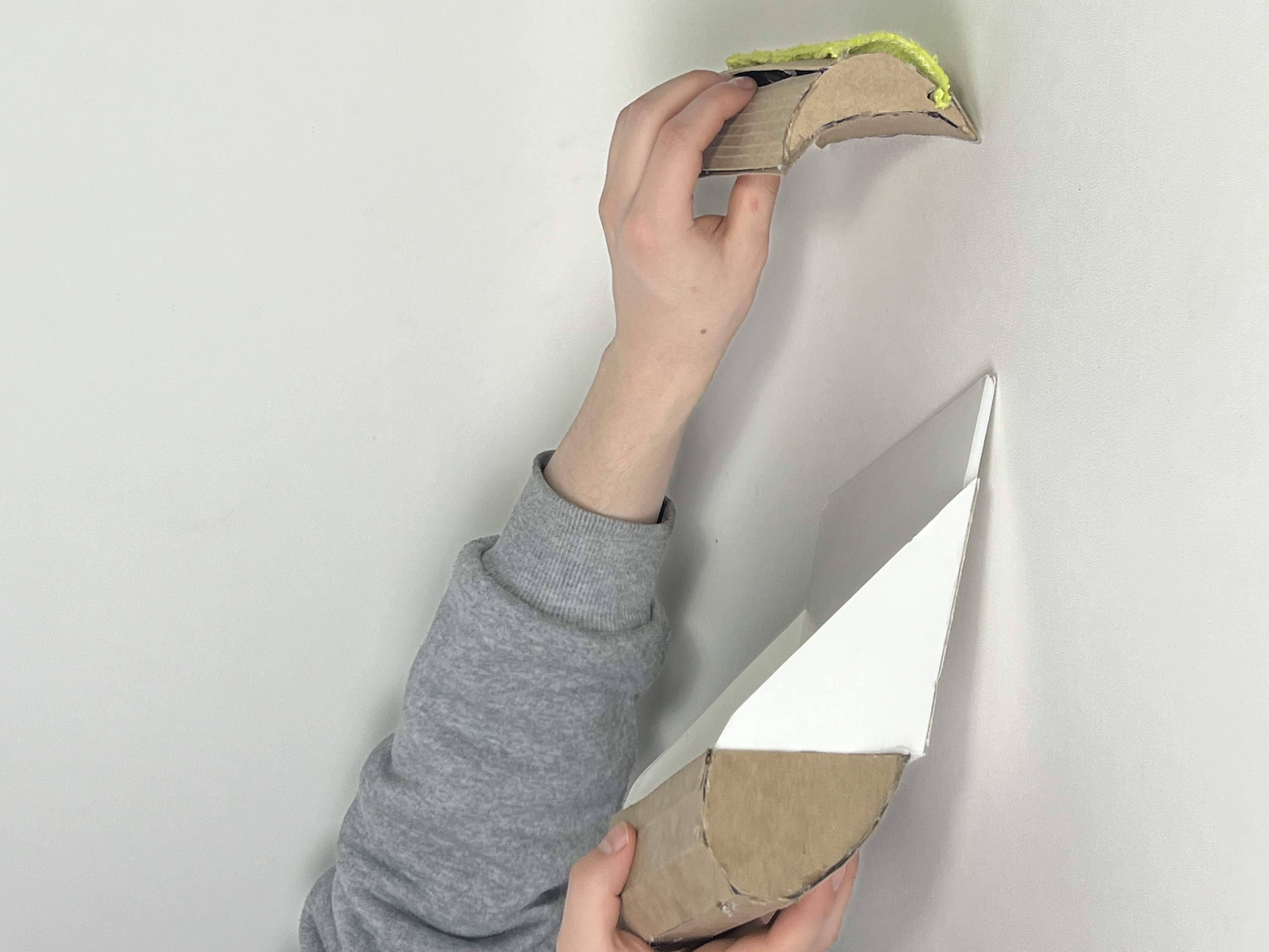
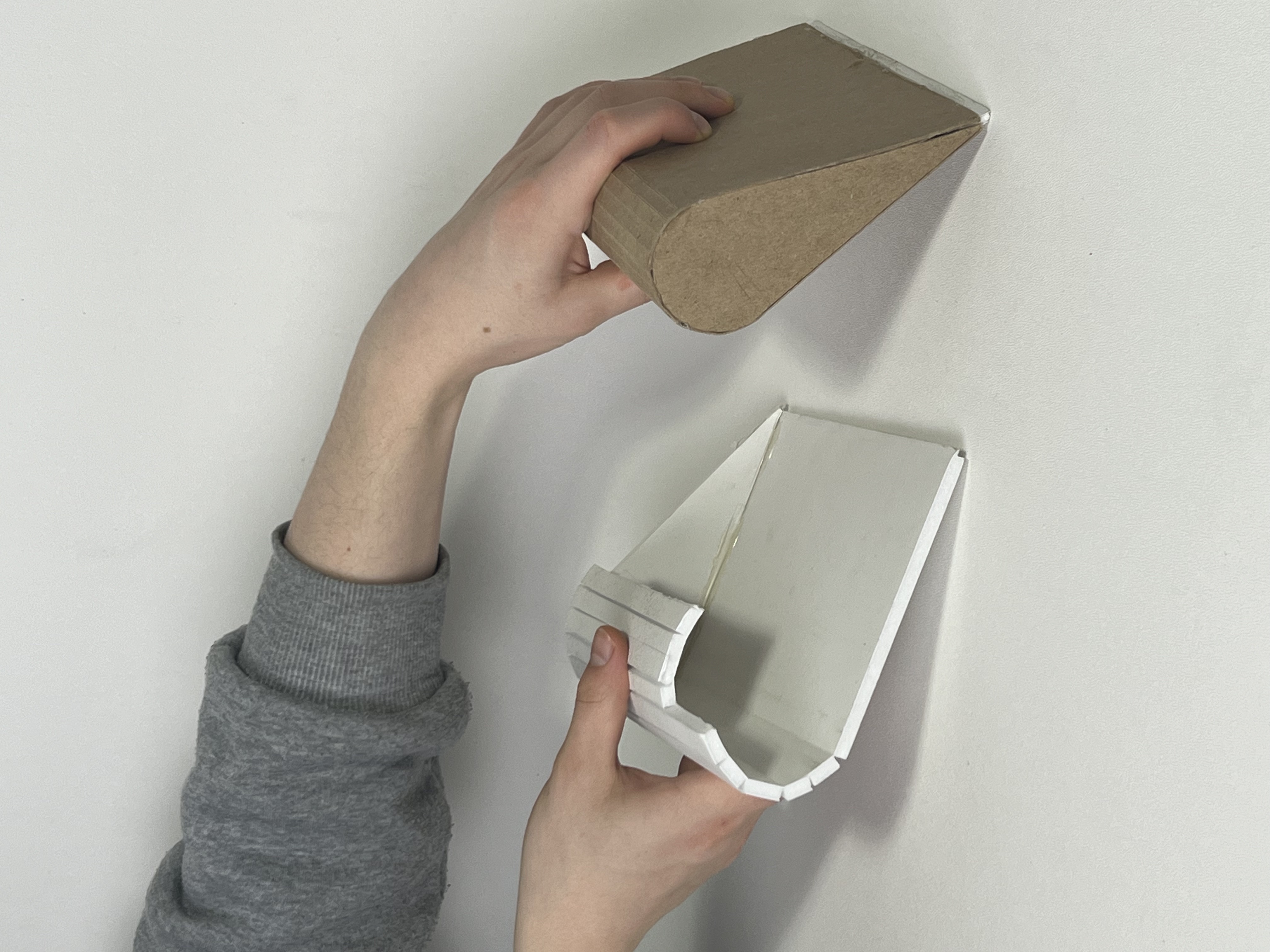
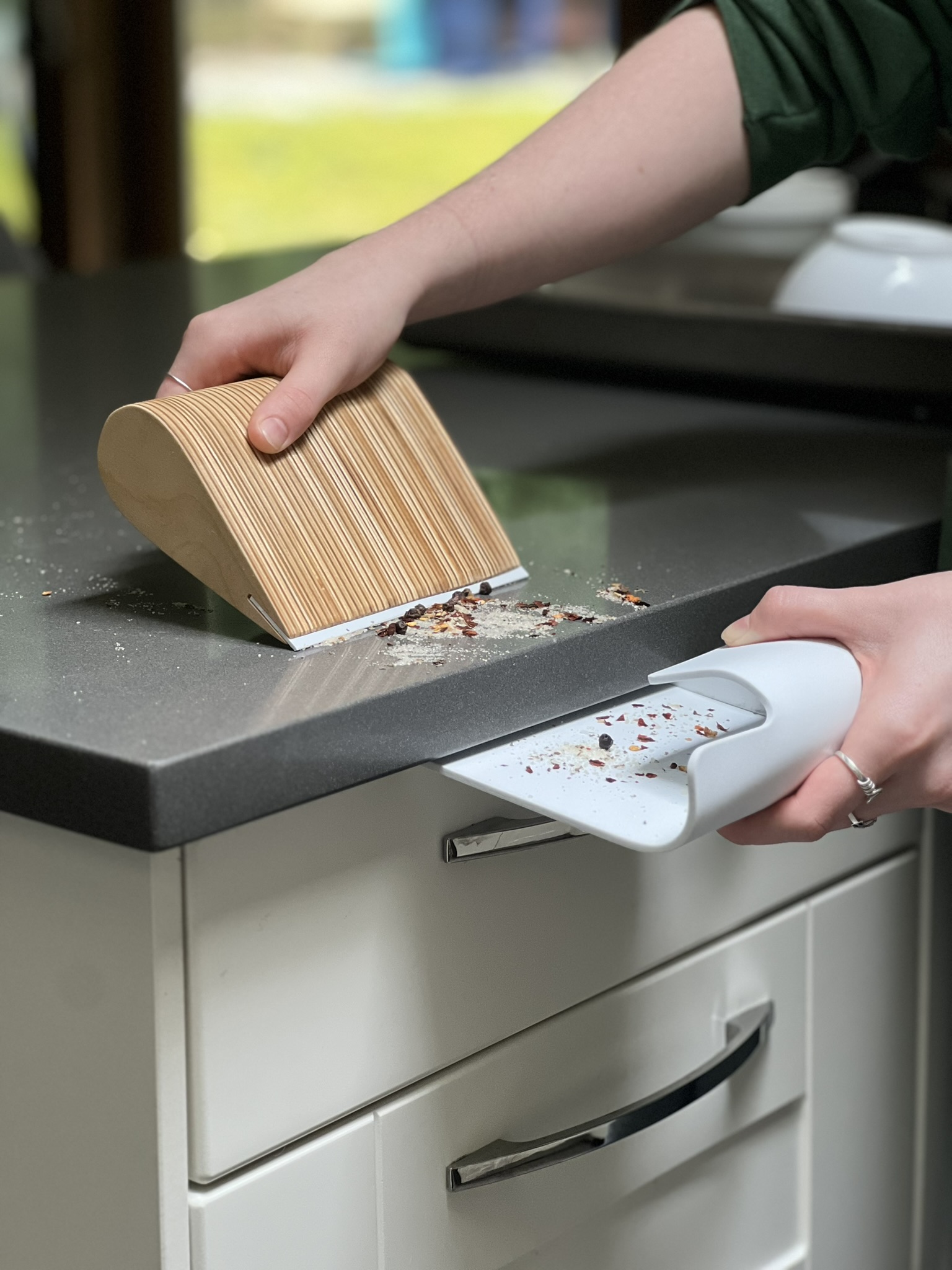
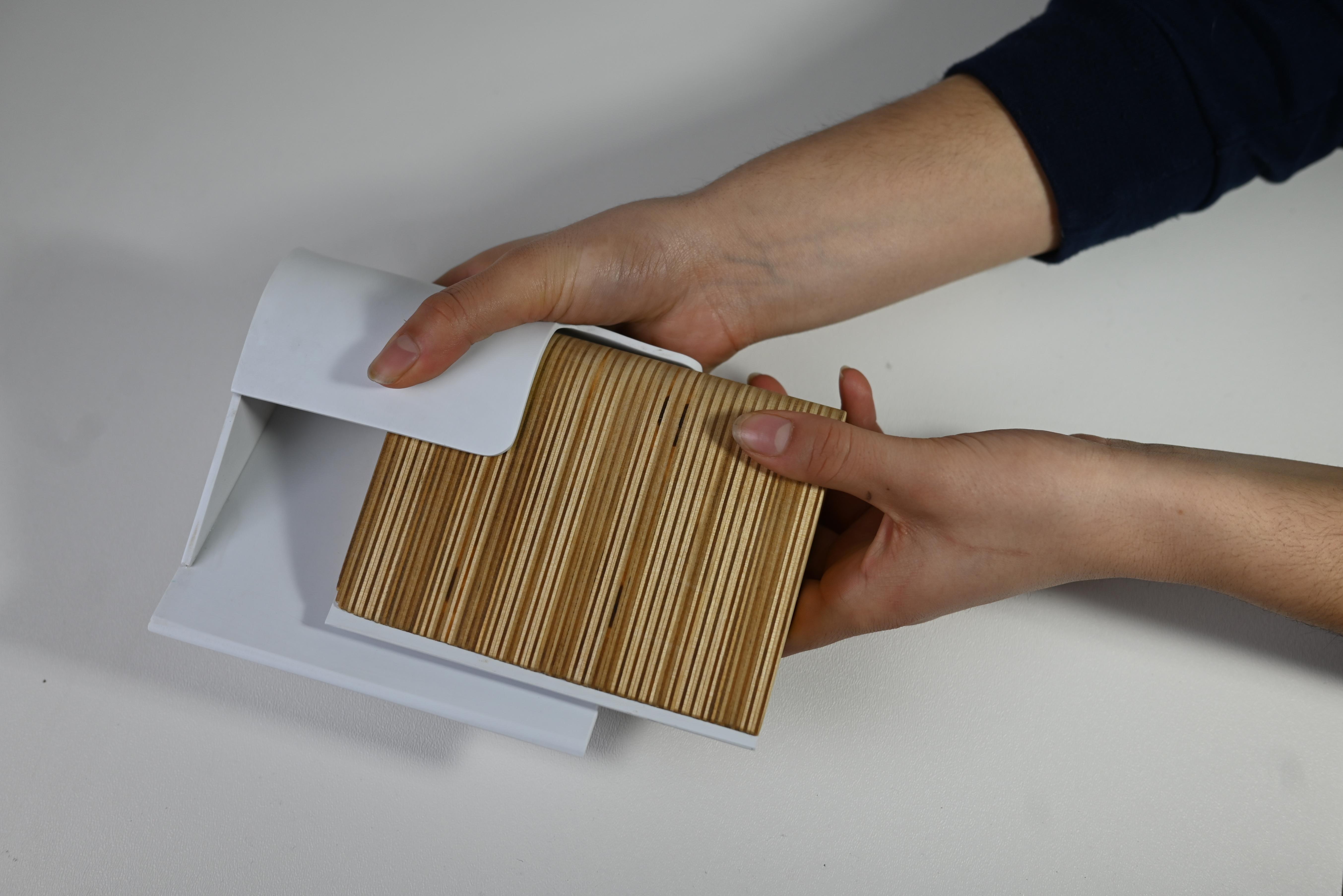
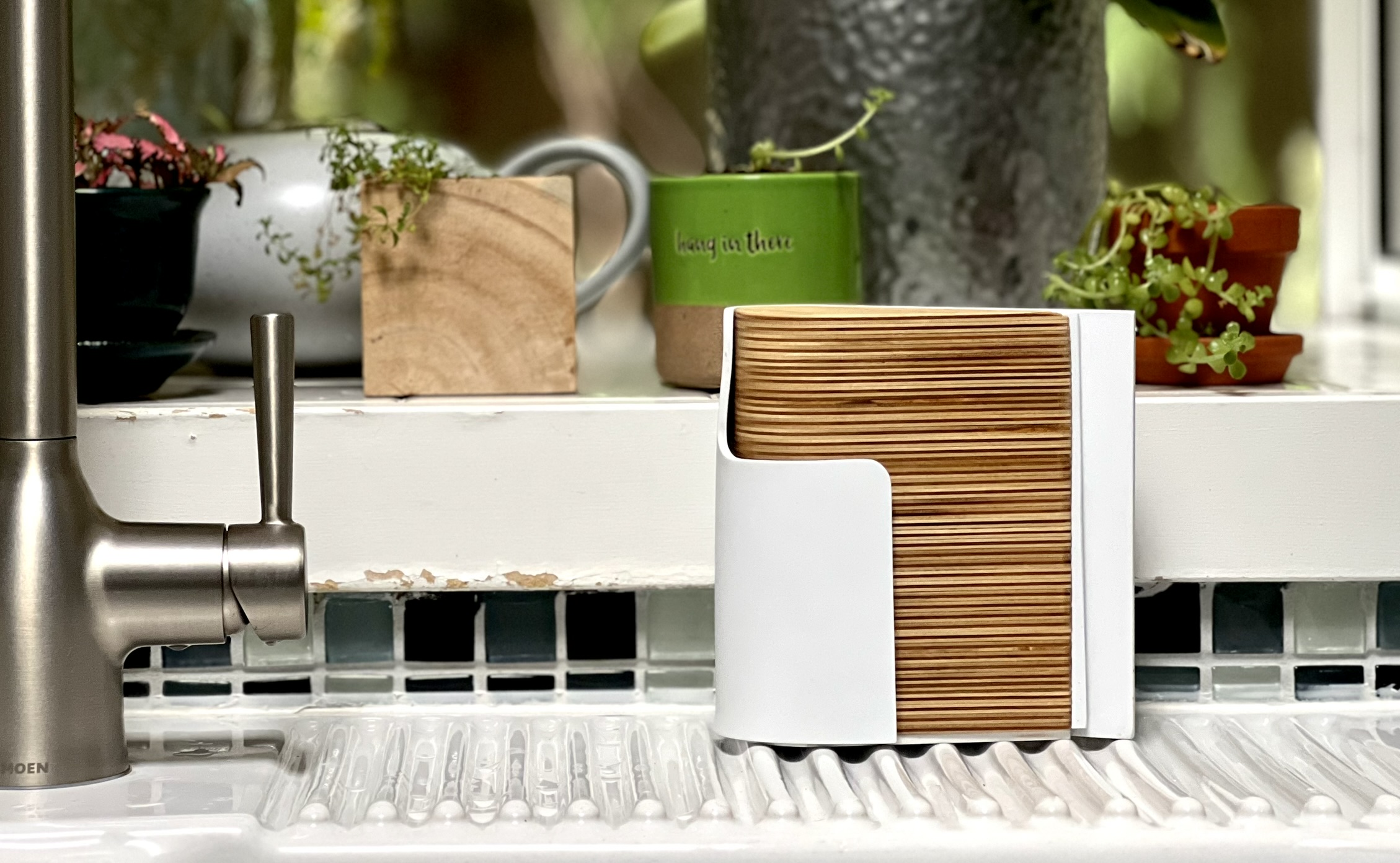
Final resolved form. The wave geometry simultaneously drives the ergonomics, the nesting connection, and the visual identity of the system.
First instinct — rough, blocky, no form cohesion. Useful only as a starting point to understand the scale and basic motion of the task.
Introduced a curved sweeping edge. The collector still felt like a separate object — no visual or physical relationship between the two parts.
Explored nesting for the first time. The wave curve began to emerge as both the ergonomic and structural logic of the system.
Refined the swoop and tightened the nesting fit. Material contrast between wood handle and PS collector was tested here for the first time.
Final resolved form. The wave geometry simultaneously drives the ergonomics, the nesting connection, and the visual identity of the system.


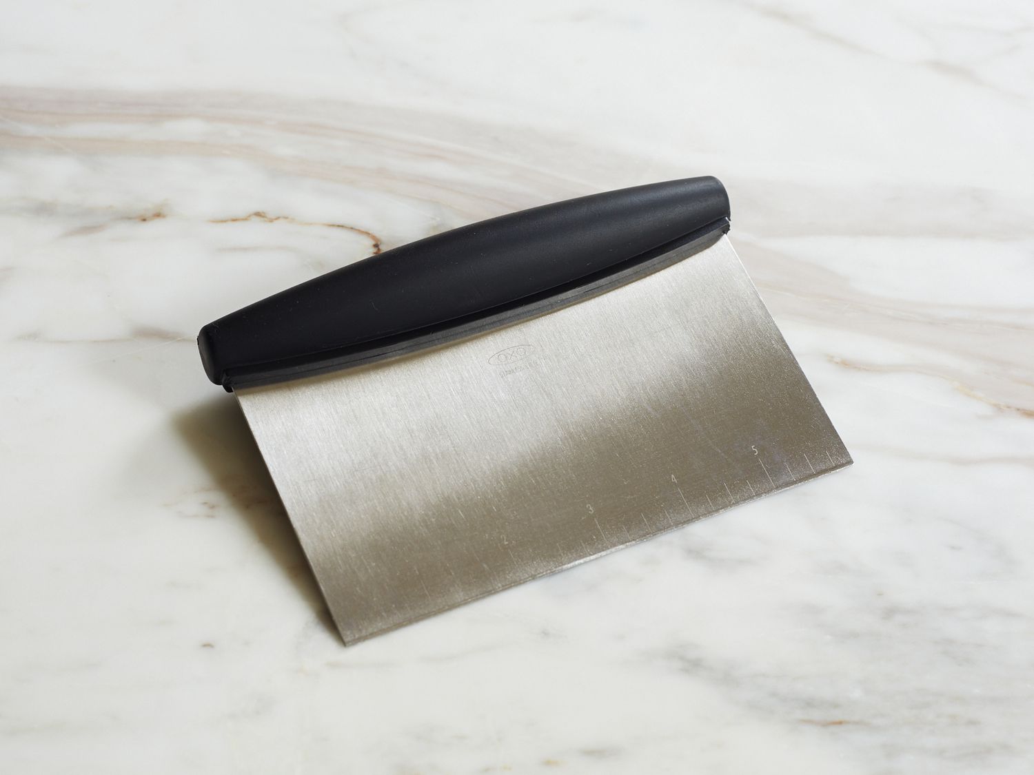 Scraper
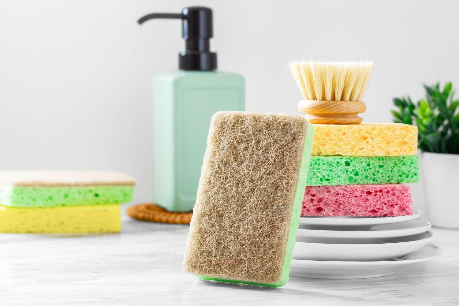 Sponge
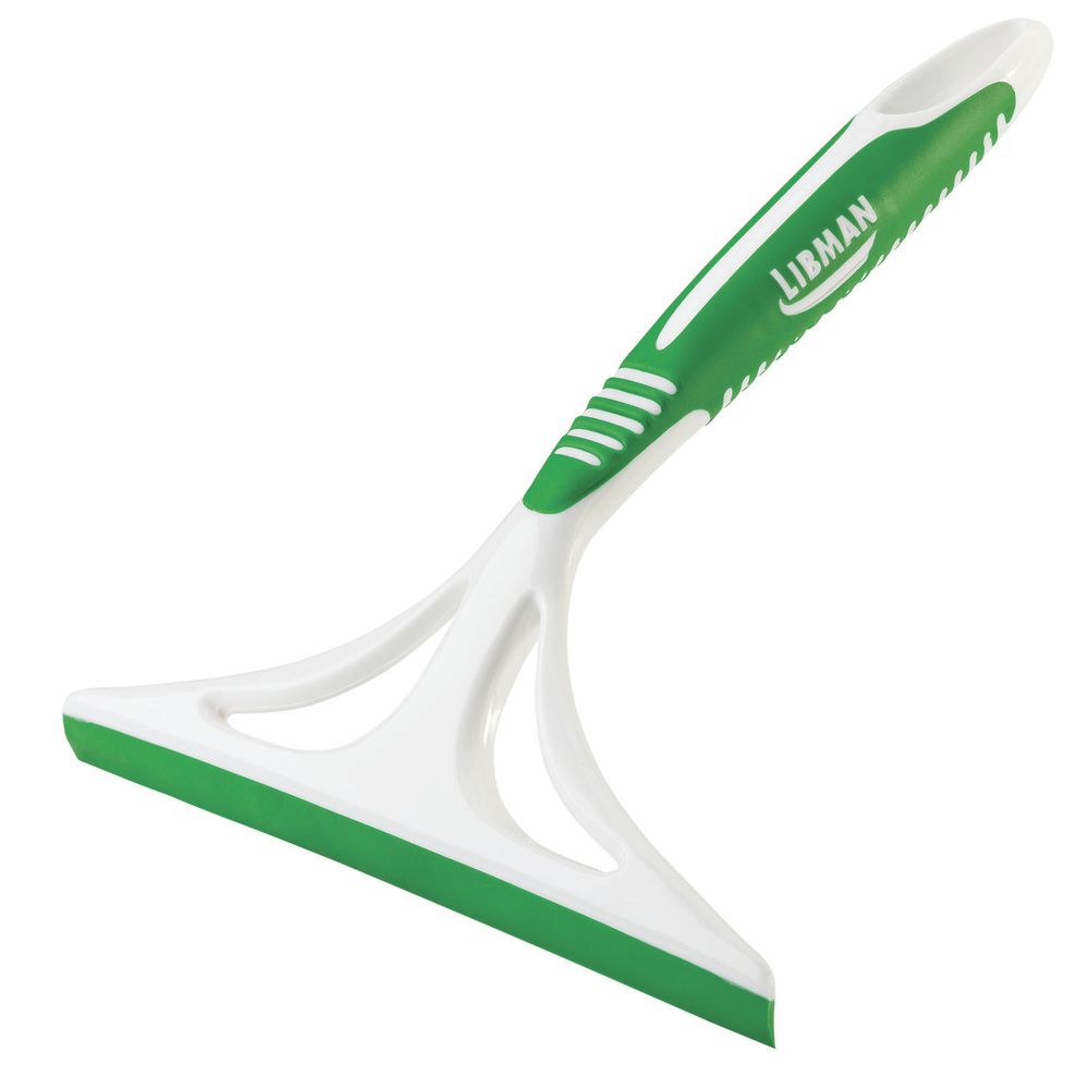 Squeegee
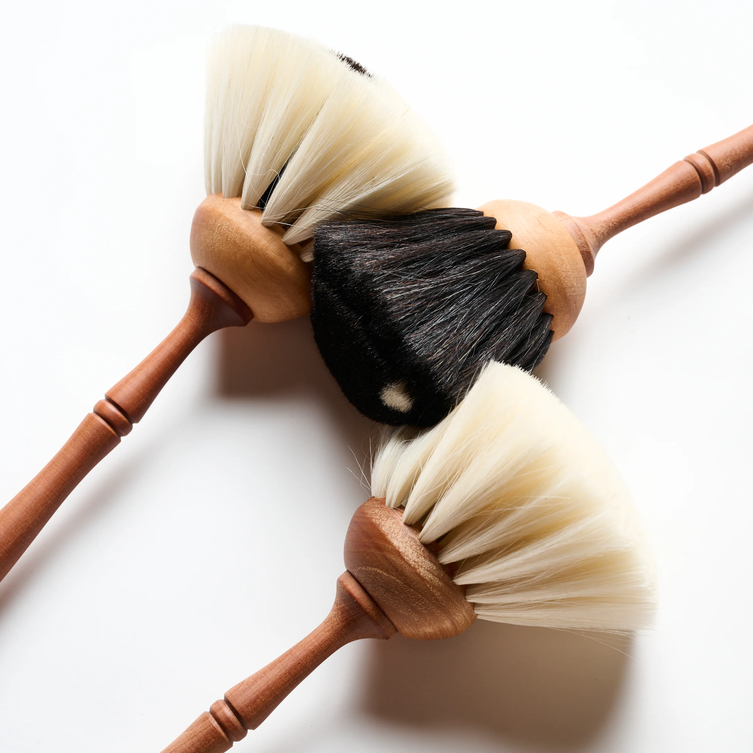 Brush
Brush